UX Research
Prototyping
Product Design
Role
Figma
Miro
Google Form/Survey Moneky
Tools
Duration
Personal Project - 3 weeks
CONTEXT
How can we make it easier for users to find payment options without confusion?
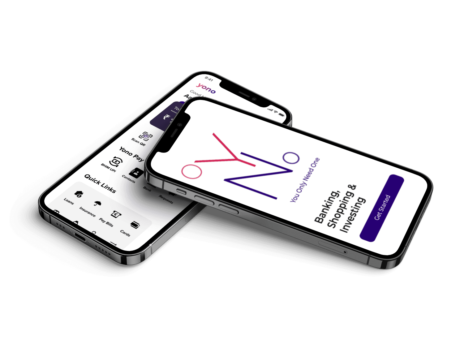
When my aunt tried using the YONO app, she was instantly lost. Tiny text, cluttered menus, and endless scrolling made simple tasks frustrating. Finding a basic feature like fund transfer felt like solving a puzzle. Even I struggled—and I’m used to complex apps! Banking shouldn’t feel this overwhelming. Watching her frustration, I knew something had to change. That’s when I decided to redesign YONO, making it simple, clear, and easy for everyone.
Despite SBI’s popularity, the YONO app had noticeable inconveniences—especially when trying to find the money transfer options or check my balance. This made me wonder: What other user challenges exist in YONO, and how can I redesign the app to simplify and streamline these experiences?
PROBLEM SPACE
How can we make it easier for users to find payment options without confusion?
Frequent YONO users need quick access to their account transactions and balance with fewer clicks, saving time and ensuring they never miss a payment.
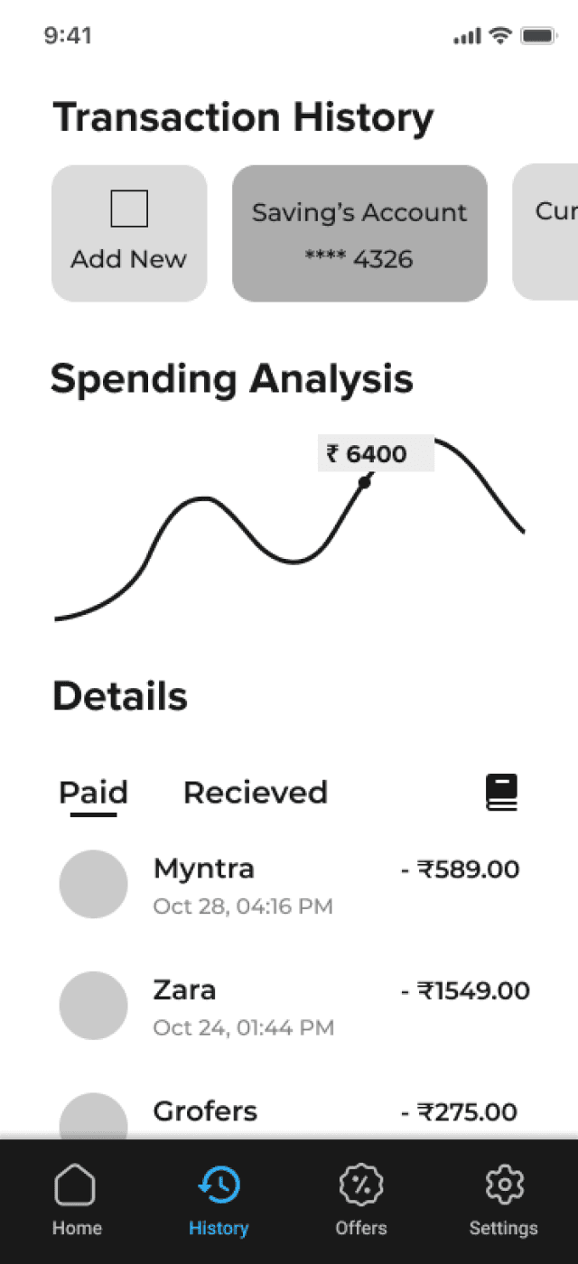
Easy Access To Check Balance/Multiple Accounts
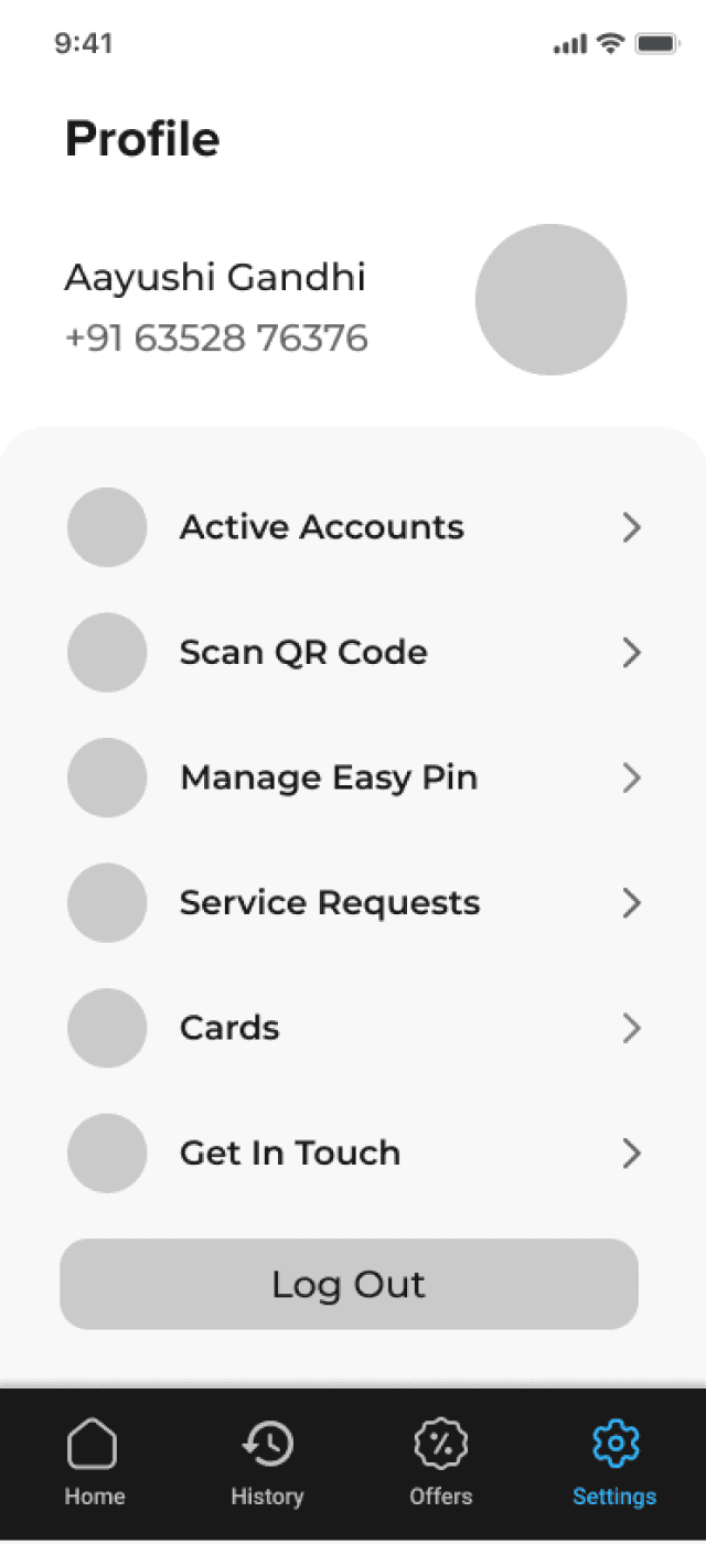
Smooth and Safe onboarding and profile management
Users want to log in or create an account in just a few steps and view all the accounts linked to their name which simplifies the process and provides easy access to all my accounts in one place.
The Proposed Solution
Using the findings that I discovered, I was able to complete a final redesign. I added new features and expanded on ones that were already prototyped.
Solution
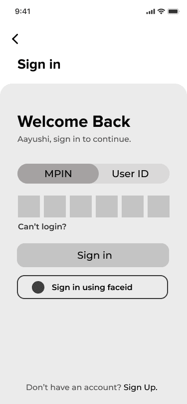
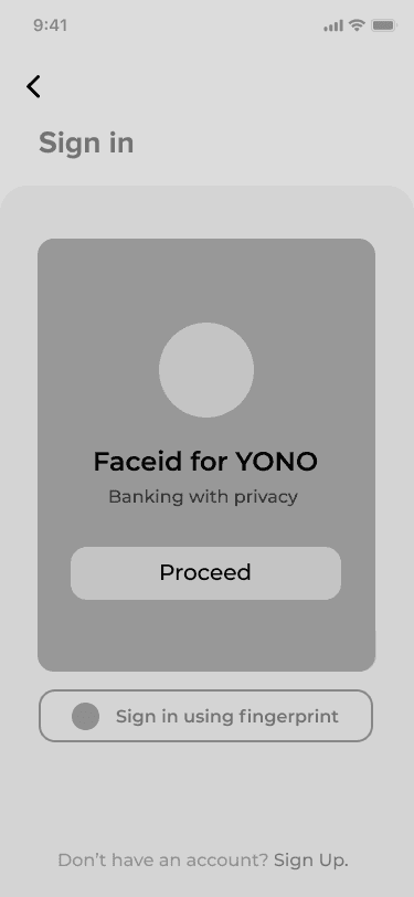
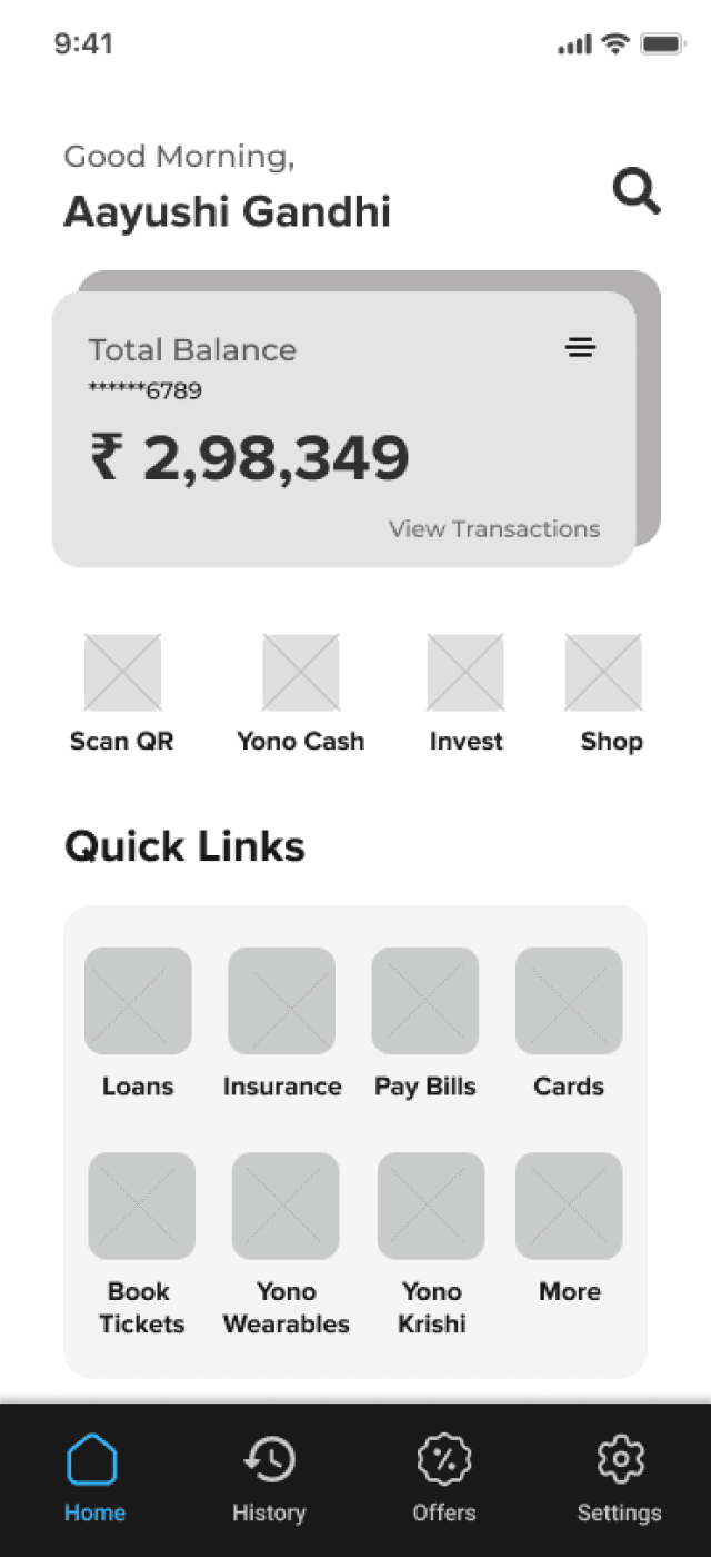
A simple sign up or log in page. Instead of login in for different things I made the quick pay option on the homepage which takes same or less time to get the action done.
Login/Signup Page
The app’s home page consists of Total Balance amount. Now you can easily toggle between multiple accounts letting users check balance and previous transactions in a few clicks.
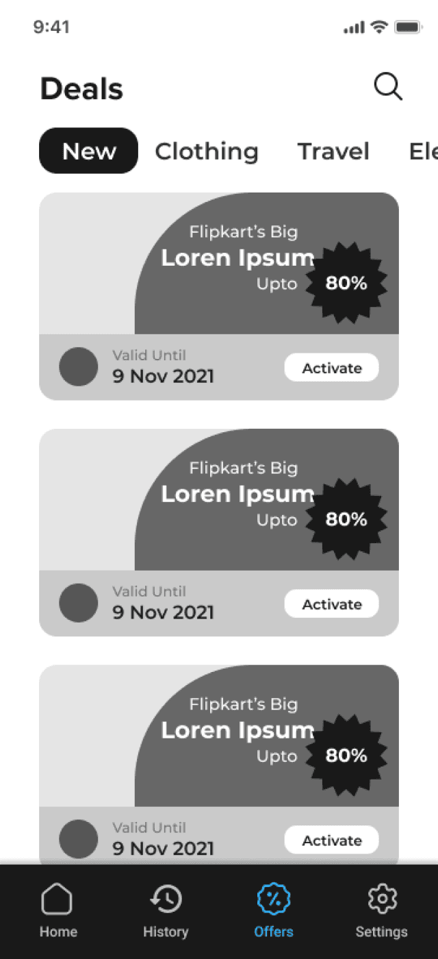
A less cluttered and more organized page to shop and check out best deals.
Offers Page
The message was clear.
I talked to 10 people about the issues they face using YONO Sbi app.
Research summary
Competitive Analysis
I examined other apps in India first like HDFC or Kotak, they had similar issues. So I checked globally and found Revolut and Chase to analyze.
After logging in, Revolut allows users to instantly view their balance and completed transactions. Users can also switch between different accounts with a simple click. This inspired me to make the balance section more prominent and easily accessible for YONO users.

It’s login screen is clean and straightforward, offering two main options for returning users: PIN or FaceID, along with a clear signup option for new users. This simplicity makes the process less overwhelming. The payment options in Chase are well-organized, with a dedicated tab for additional payment methods. Plus, features like Zelle and the ability to deposit checks are conveniently available right on the first page.

Crafting the UI components with wireframes
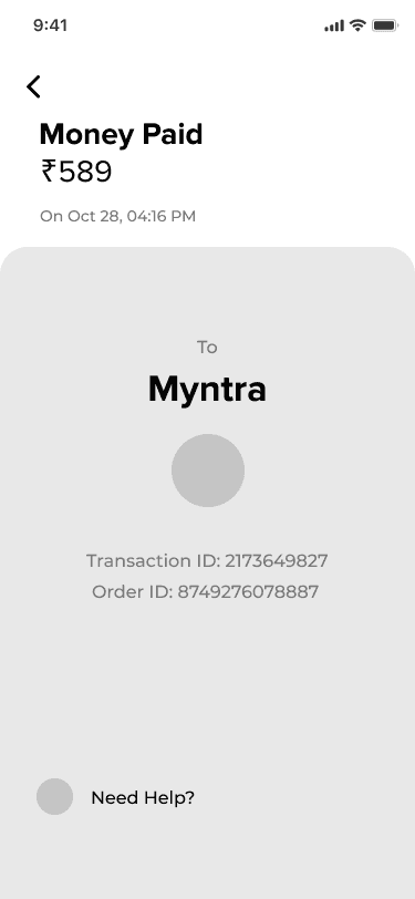
Based on findings from my user research, I was inspired to sketch out a couple redesign ideas on paper. My primary focus was on maintaining simplicity and clarity in the user flow.

Thoughts
Redesigning the YONO app was an exciting challenge that allowed me to rethink how users interact with a banking platform. Through research, user testing, and analyzing competitors like Revolut and Chase, I discovered key pain points that hindered usability—like cluttered interfaces and difficult navigation. By simplifying the design, making essential features more accessible, and improving the onboarding experience, I aimed to create a more intuitive and user-friendly app. This project highlighted the importance of understanding users’ needs and how thoughtful design can transform everyday tasks into seamless experiences. I’m excited to see how these changes can make banking more efficient for everyone.
Final thoughts
25%
reduction in user friction
83%
increase in user satisfaction
© Copyright
