UX Research
UI design
Prototyping
Interviews
Role- Lead UX/UI designer
Figma
Miro
Survey Monkey
Tools
Duration
Client - 4 weeks
Problem
Giiava began a redesign of its entire B2B website with a vision of having a new face and better consumer attention.
It is a family-owned group of companies founded in 2004 under the name Synergy Foods. They manufacture edible oil derivatives.
Giiava's homepage serves as the initial point of contact for users upon accessing the website. Nevertheless, my research and data analysis indicate that users allocate minimal time to this page and seldom revisit the website.
SUMMARY
Results
During our last user testing, we reached about 5% of our active users, totaling 100.
46%
increase in user Satisfaction
GIIAVA
IDEATION
Giiava began a redesign of its entire B2B website with a vision of having a new face and better consumer attention.
It is a family-owned group of companies founded in 2004 under the name Synergy Foods. They manufacture edible oil derivatives.
Challenge
The Research and data analysis reveal that users spend minimal time on the homepage and rarely revisit the site.
Objective
Transform the Giiava website into a user-centric platform that effectively attracts new customers and retains existing ones. This will be achieved through:
Optimizing the user experience (UX) for target customers: Tailoring the website's design and functionality to the specific needs and expectations of Giiava's ideal B2B customer.
Creating a consistent user interface (UI): Implementing a cohesive visual language throughout the website using common UI elements. This will ensure a seamless and intuitive user experience.
Utilizing easy-to-read typography: Employing clear and well-organized typography to establish hierarchy and enhance readability. Effective use of typography will guide users through the website and make it easier to find the information they need.
How to...
How can we deliver an enriching and captivating experience for our users?
How can we enable them to effortlessly access vital event details while maintaining their engagement?
Redesign Journey
Our process is based on Double Diamond Theory. We focused on Discover, Define, Develop and Deliver throughout our journey.
RESEARCH
Phase 1 : Discover
Current Website issues are:
Content
Overload
The website drowns visitors in a sea of information, making it cluttered and potentially overwhelming. Much of this information might not be relevant to their needs.
Visual
Blandness
The website lacks captivating elements that grab attention and engage potential customers.
Design
Shortcomings
A clear hierarchy of information is absent, making navigation confusing. Additionally, the color scheme seems out of place and doesn't contribute to a positive user experience.
Phase 2: Define
Gathering Internal Insights
To identify areas for improvement and prioritize website content, I conducted a brief survey among our client-facing team members. This internal feedback served a dual purpose: understanding what resonates with clients and uncovering opportunities for quick, impactful website enhancements.
Here's what we learned:
Grasping the Essence: Team members emphasized the need for visitors to quickly understand Giiava's core identity without extensive scrolling. The website should deliver a clear first impression.
Focus on Practical Applications: Clear and concise explanations regarding the practical uses of Lecithin and other products were highlighted as crucial. While providing detailed information is valuable, prioritizing practical applications caters to initial user needs.
Card Sorting for Optimal Information Architecture
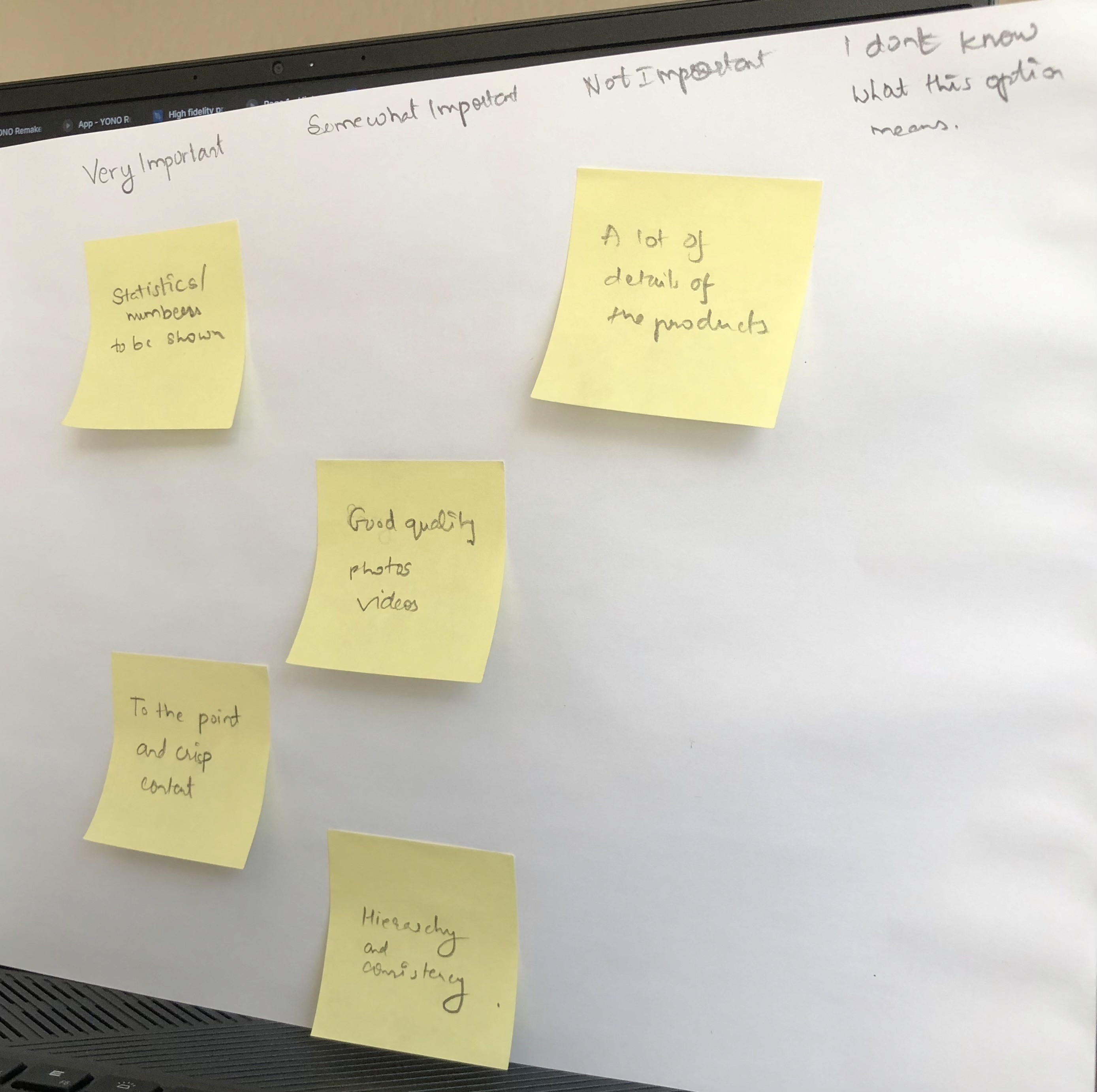
To visualize the website's ideal structure and content organization, I employed a card sorting technique. This iterative process involved repeatedly grouping website content categories – like product descriptions and contact information – based on user logic. This user-centered approach helps ensure a clear and intuitive information architecture for the final website design.
Card sorting
Design
Phase 3: User Testing Validates Design Choices
The development phase culminated in usability testing with both my team and the client. This session aimed to assess the effectiveness of the new design in terms of aesthetics and user interaction.
Pleasingly, the feedback was overwhelmingly positive. Testers expressed satisfaction with the following design elements:
Color Palette: The chosen color scheme resonated well with both the team and the client.
Typography: The selected typography was deemed clear, readable, and aesthetically pleasing.
Whitespace Utilization: The use of white space was praised for creating a sense of balance and improving readability.
Graphic Design: The incorporation of cool graphics was well-received, adding visual interest to the website.
This positive user testing feedback served as a strong validation of the design choices made during the development phase.
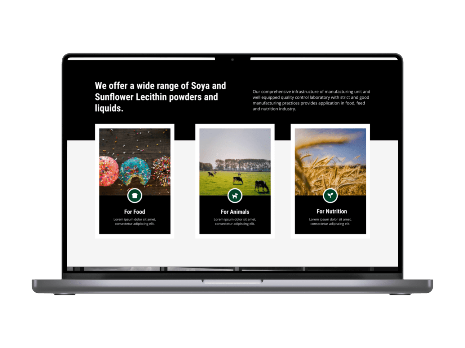
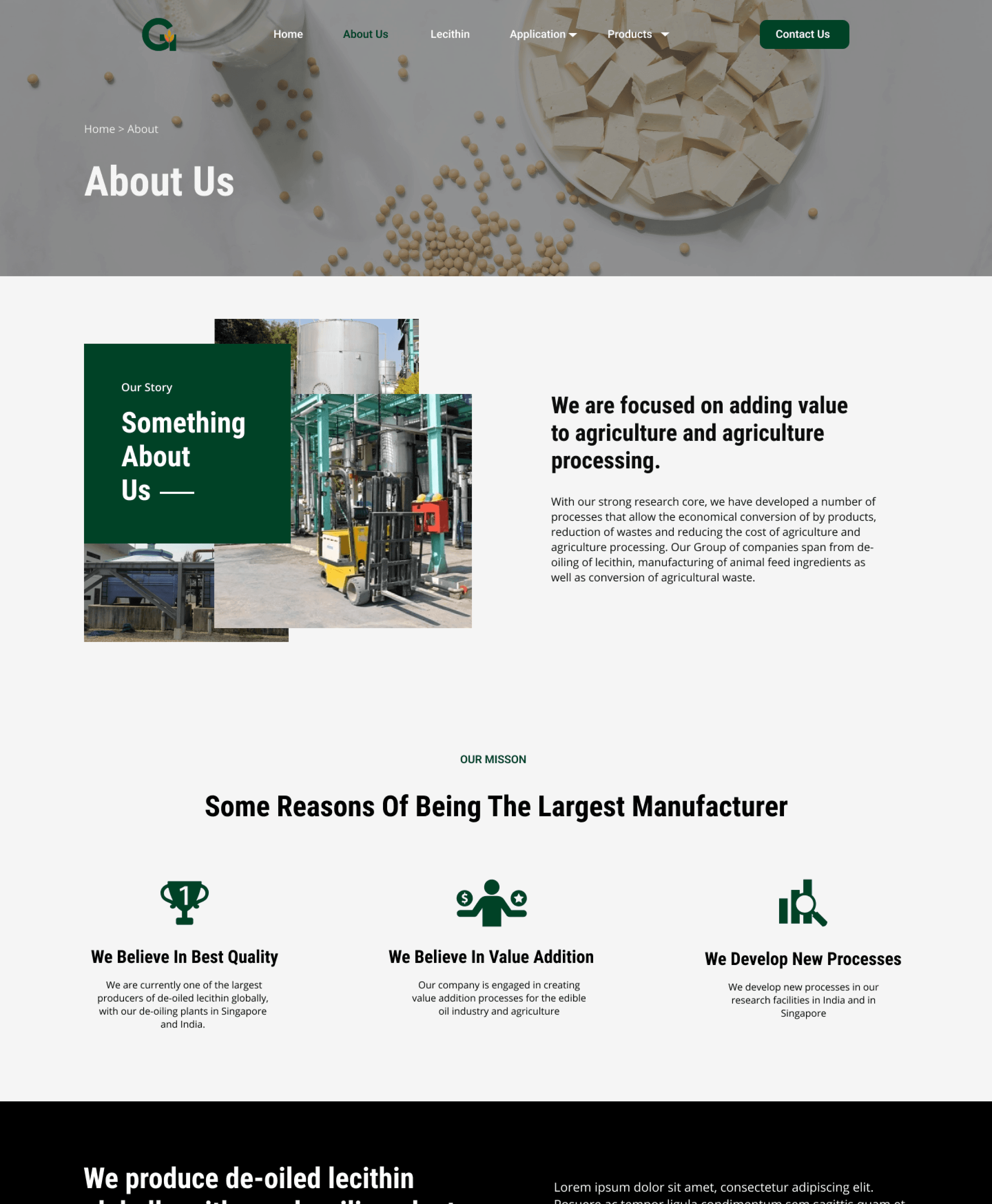
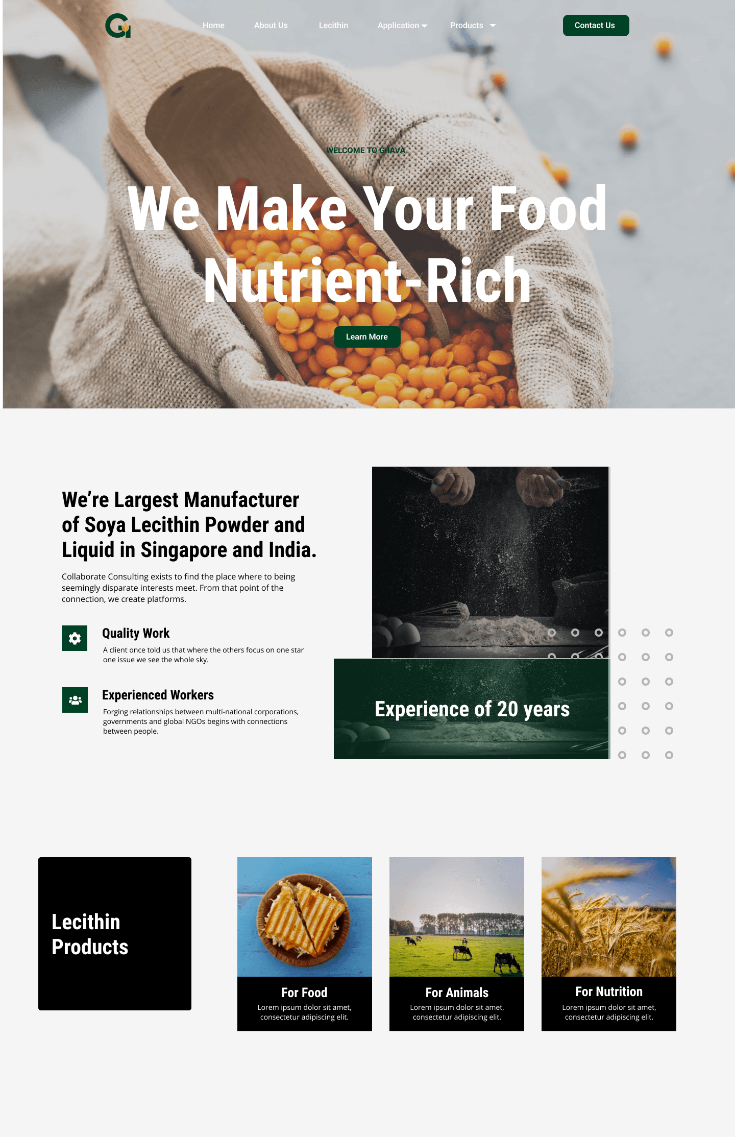
Having secured positive user feedback, I transitioned to the final stage: delivering the high-fidelity website design.
This involved creating high-quality mockups for every website page using Figma, a design software. These detailed mockups served as a blueprint for the development team. They meticulously replicated the design using WordPress, a popular content management system, ensuring a visually stunning and user-friendly website upon launch.
Phase 4: Delivering the Redesigned Website
Results and takeaways
Since, the last interaction with the client, they have liked this makeover of their website. I am surely waiting for the development team to deploy these changes on the final website.
Lessons Learned
🎯 Research-Driven MVP Definition
Aligning user insights with design priorities.
🖥️ Iterative Design Process
Improving the design based on feedback and analysis, rather than aiming for a perfect design from the outset.
If I Had More Time…
📌 I would conduct in-depth user interviews to uncover unspoken needs.
📌 I would run A/B tests on feature discovery methods to fine-tune engagement strategies.
© Copyright
