UX Research
Prototyping
Product Design
Figma
Miro
Google Form/Survey Moneky
Duration
Personal Project - 3 weeks
Role
Tools
Restructuring YONO SBI Bank’s app to ease the user experience on transaction and shopping sections for people of all ages.
What?
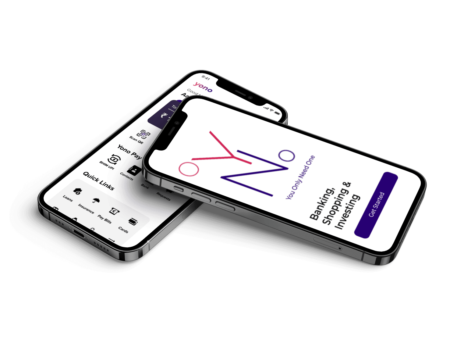
SBI's YONO app, boasting a vast array of features from payments to shopping, has seen a surge in users post-pandemic. However, its clunky user experience (UX) makes even basic tasks like transaction history a chore.
This redesign focuses on simplifying the UX, making YONO user-friendly and efficient. Through user research, competitor analysis, and a focus on core functionalities, the aim is to create a mobile banking experience worthy of India's biggest bank.
SUMMARY
Final Designs

Results
Leveraging user research, prototyping, and competitor analysis, I undertook a comprehensive redesign. The focus? Streamlining the user journey and aligning the interface with brand guidelines.
The results speak for themselves: a remarkable 75% improvement in user experience. This user-centered approach transformed YONO into a mobile banking app that truly delivers for SBI's customers.
State Bank of India
The State Bank of India (SBI) is the largest bank in India with over 450 million accounts and is also one of the biggest corporations in the world.
YONO is an integrated digital banking platform, with more than 27 million users, offered by SBI to enable users to access a variety of financial and other services.
IDEATION
Banking with SBI is easy and stress-free.
But checking balance on YONO app can be daunting.
Goals
Design Goals
Simplifying the UI, making it as clean as possible by reducing clutter.
Optimizing UX for target customers.
Adding focus to main features like YONO Pay, Investing, and shopping.
Business Objectives
Adoption of users from traditional branch experience to the mobile app.
Retention of customers.
Lesser hassles and steps, increased efficiency.
Problem
In my year-long interaction with the YONO App, I've encountered multiple issues that significantly mar the user experience, a concerning aspect considering SBI's reputable stature. The app's cluttered interface, outdated design, and disorganized layout have prompted me to undertake the task of overhauling its usability.
Despite being well-versed in complex interfaces, I found myself grappling with navigation and essential feature discovery within the app. This concern hit home when I assisted my aunt, who was advised by SBI to use the app due to pandemic-related passbook limitations. Her struggles highlighted the app's complexity. This spurred me to initiate a redesign of the YONO App interface, aiming to create a more user-intuitive experience for both technologically inclined users and those less comfortable with digital platforms.
My impact
For this project I validated the need for an app that is easy to use and intuitive for any user to use. I leveraged data from the research to create an end-to-end product as a solo designer.
RESEARCH
Diving Deeper into YONO's UX Issues
Having experienced YONO's frustrations firsthand, I decided to delve deeper. My goal: a comprehensive analysis to pinpoint the app's weaknesses.
Knowing the app's basics wasn't enough. To identify all the user experience (UX) hiccups, I needed to understand:
Features: A complete picture of what YONO offers, from core banking functions to lesser-known features.
Structure and Architecture: How the app is built, how information is organized, and how users move between different sections.
Navigation: The ease or difficulty of finding specific features and completing tasks within the app.
With this in-depth analysis, I aimed to uncover the root causes of YONO's user-friendliness problems.






1
2
3
4
5
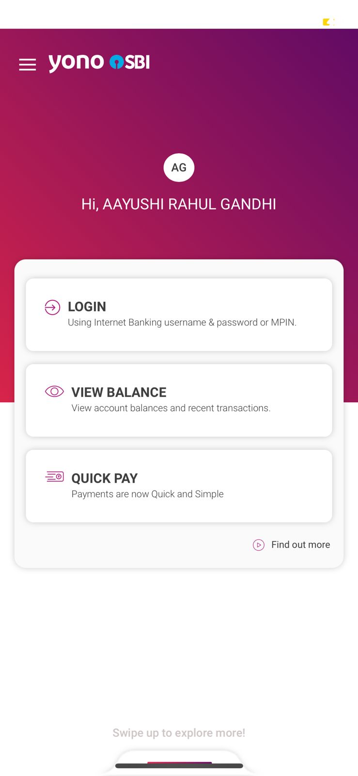
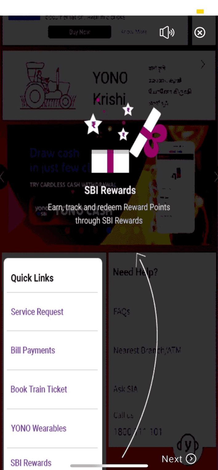
Three features displayed on this screen. All of them requires credetials to login.
Home Page 1
For first time users, one has to go through 10-12 screen of “how to use” the app
Tips
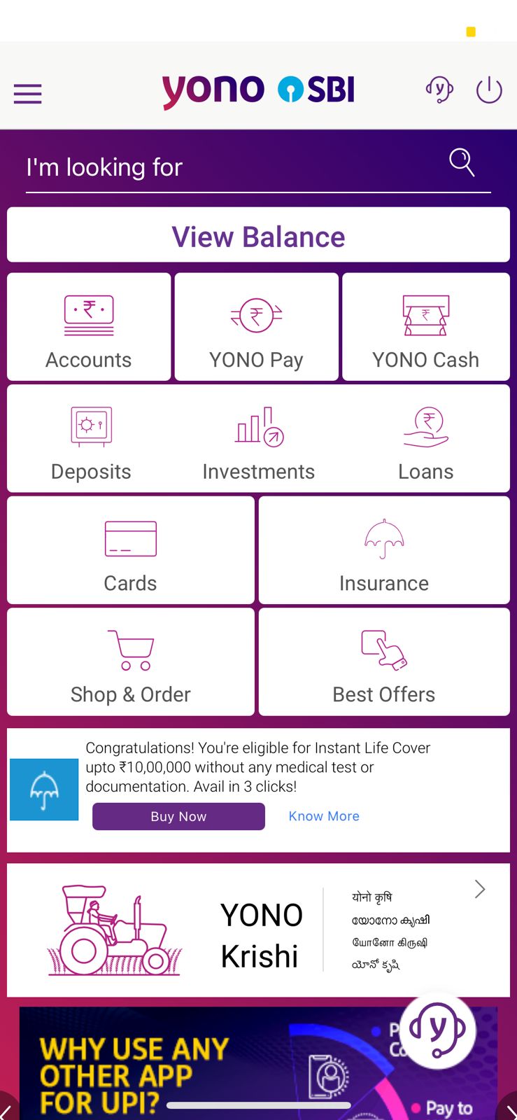
This page has variety of options for a user to choose from.
Home Page 2
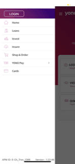
This section has almost all the sections which are displayed on homepage 2.
Menu
Offers & deals of various different brands are displayed here.
Shop & Order
Glimpse of Official YONO App
YONO's Usability Issues: A User Survey
To understand user frustrations beyond my own, I conducted a mini usability study. I surveyed 14 YONO users (SBI account holders) and interviewed 3 in-depth. Here are the 3 key pain points that emerged:
Complex
Onboarding
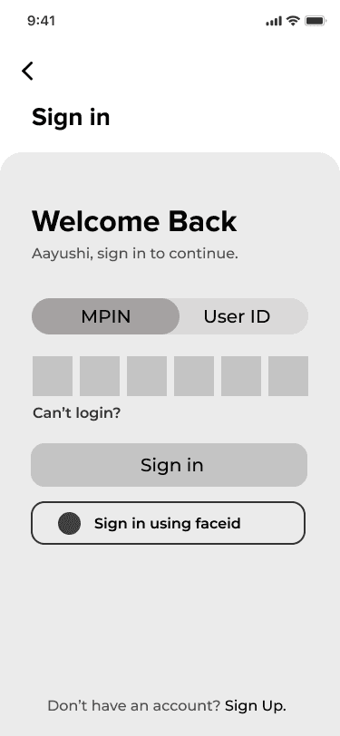
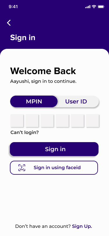
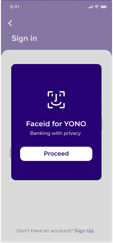
New users find the login process confusing, with multiple options (MPIN, User ID, biometrics). A simpler login screen is desperately needed.
Balance and
Account Management
Users crave easy access to their account balances. They want them displayed prominently on the main screen, along with the ability to easily switch between linked accounts.
Confusing
Navigation
Users often feel lost within the app. Inconsistent back button placement and a lack of clear hierarchy make navigating to specific features a frustrating task.
YONO App Reviews Reinforce User Frustrations
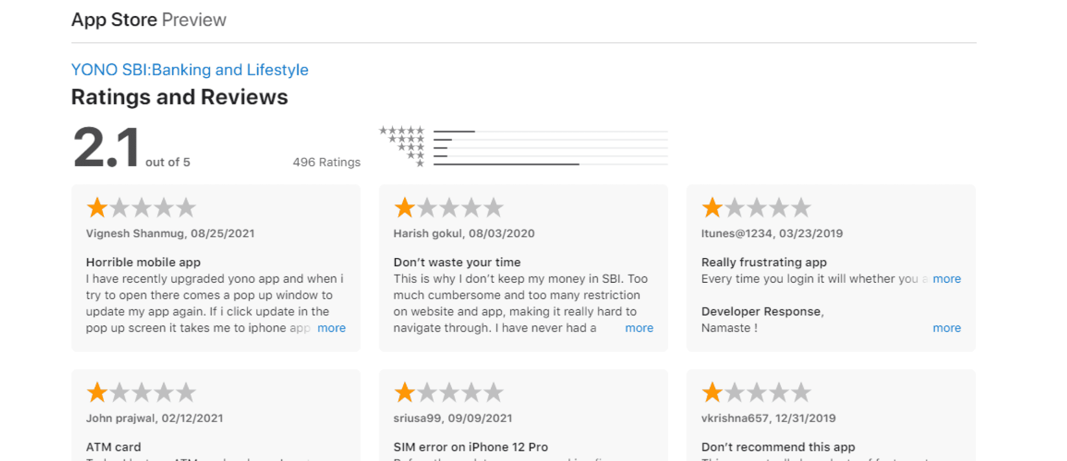
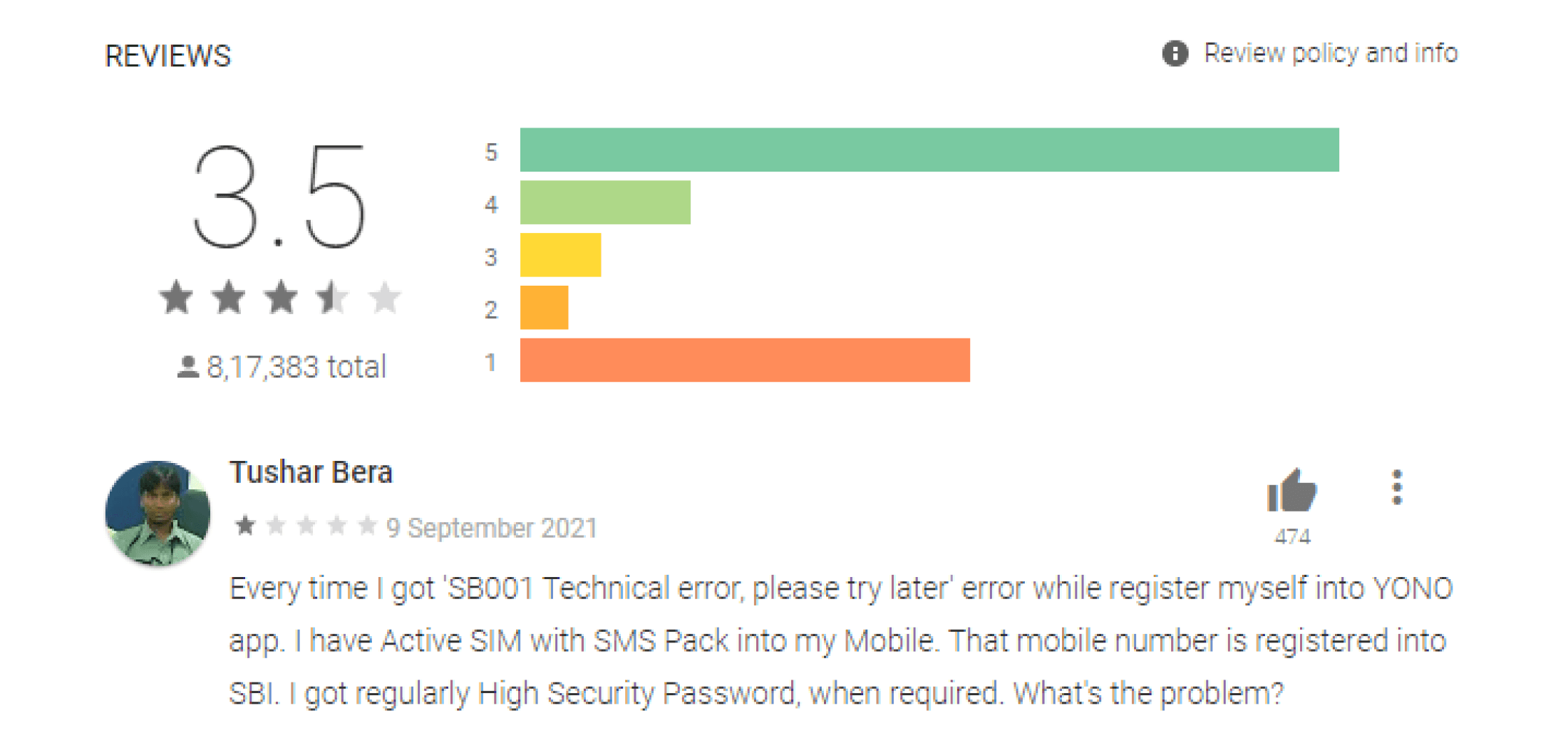
It became abundantly clear that my experience, and the issues identified in the survey, were far from isolated. Users across the board are expressing frustration and disappointment with the app's usability.
These reviews mirrored the pain points revealed in my survey:
Underutilized features due to lack of awareness
Poor navigation leading to user confusion
Tedious and time-consuming money transfer process
By addressing these common frustrations, SBI can create a mobile banking experience worthy of India's leading bank.
App Store
Play Store
Here are 6 main Pain Points, on which
I have worked on.


Users have to Click again to check the balance amount
Most users are unaware of YONO CASH feature.
The most important sections of YONO loose focus due to so many options on homescreen.
Customers hardly use these features.(Insurance, Investments, shopping, DeMat, )
Everything on this screen is so cluttered that it becomes difficult to focus on main goals for a user.
Home screen
2. Home screen


This screen has three sections. The problem here is every section needs credentials to login.
Shopping section of YONO has misaligned cards with no proper distinction between two different offers.
Plus the images used are blurry, which makes it hard to read.
3. Login Screen/
Homescreen 1
4. Shop & Order
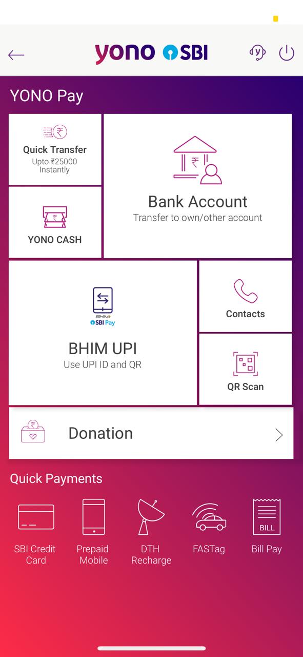

Yono Pay section has all the important feature of making and recieving a payment.
It’s a hassle for users to locate each and every feature by navigating through 4-5 screens before making an actual payment.
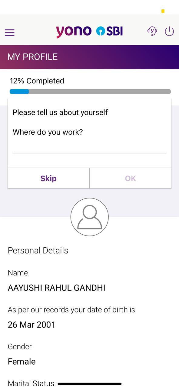

A user’s profile has a long form to fill in, Some details are unnecesary.
5. Profile
6. Yono Pay
Competitive Analysis


Frustrated by YONO's user experience (UX) myself, I decided to delve deeper. App reviews echoed these frustrations, highlighting the need for a user-centric redesign.
Revolut: Inspiration from a Global Leader
My initial hope was to find a user-friendly example within India, but the analysis revealed similar UX issues across Indian bank apps. Expanding my search globally, I discovered Revolut, a UK-based banking app praised for its exceptional UX. While security is crucial, I was able to learn from Revolut's architecture and UI through online resources. Studying their user-centered approach provided valuable inspiration for my YONO redesign efforts.
Design
Sketching
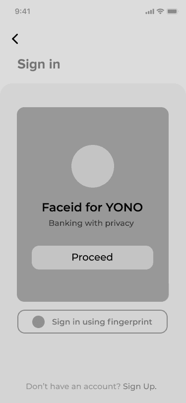
Drawing on insights from the YONO website analysis, competitor research, and exploration of leading banking apps, I embarked on the sketching phase. This involved creating low-fidelity layouts to explore optimal design solutions. Focusing on key screens, this sketching process allowed me to rapidly prototype potential solutions informed by user understanding and the pain points identified earlier. These low-fidelity prototypes will serve as the foundation for the next stage: crafting high-fidelity designs that bring my YONO redesign vision to life.
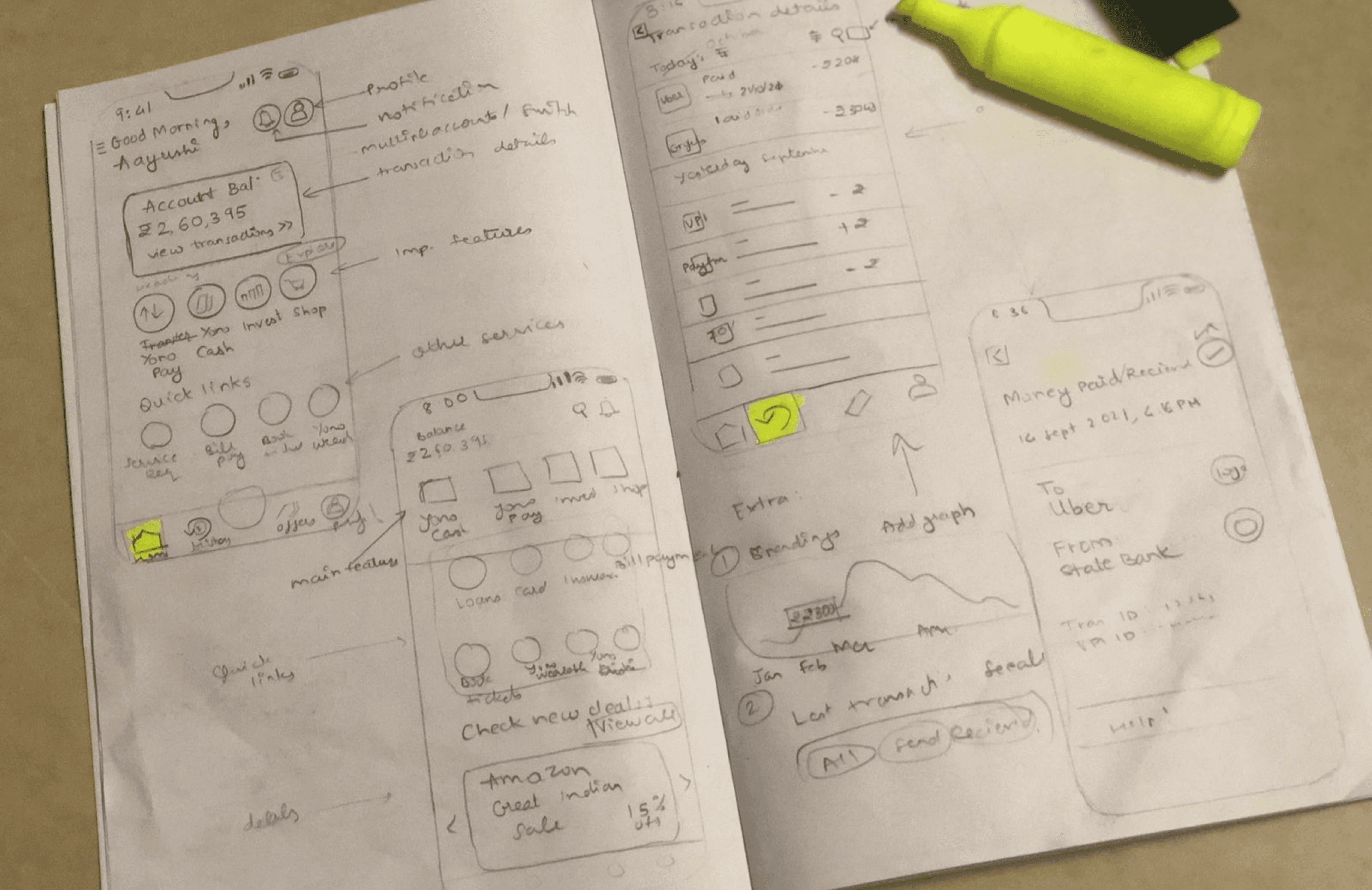
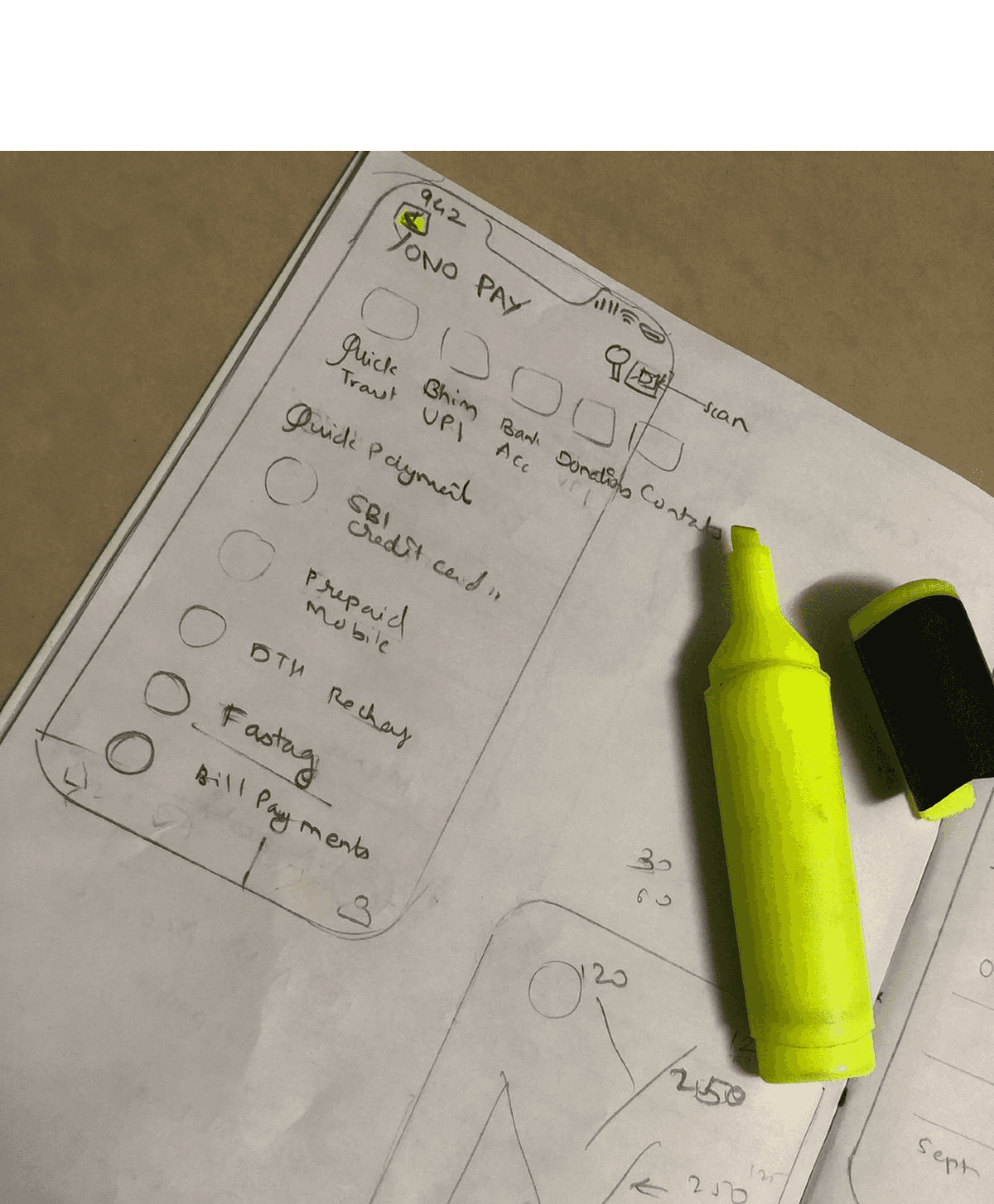
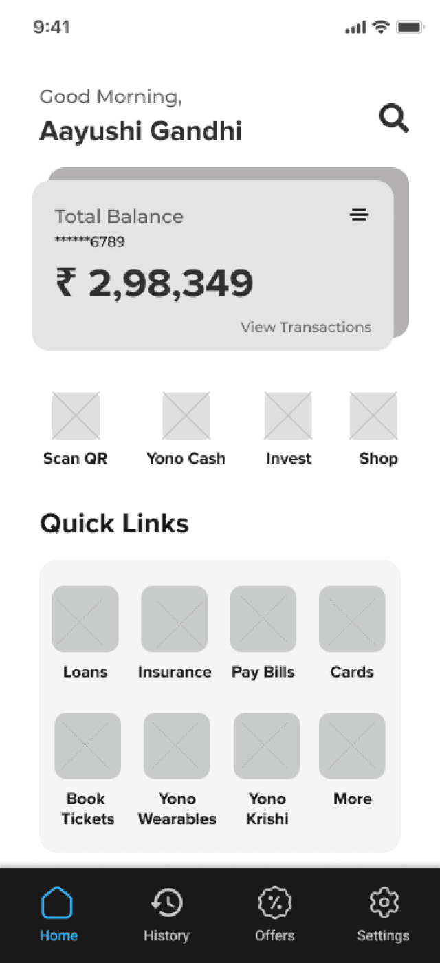
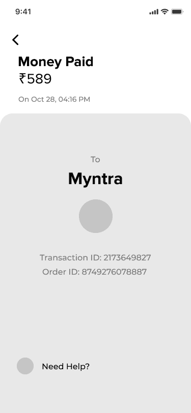
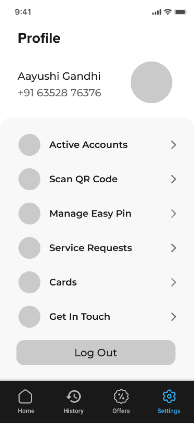
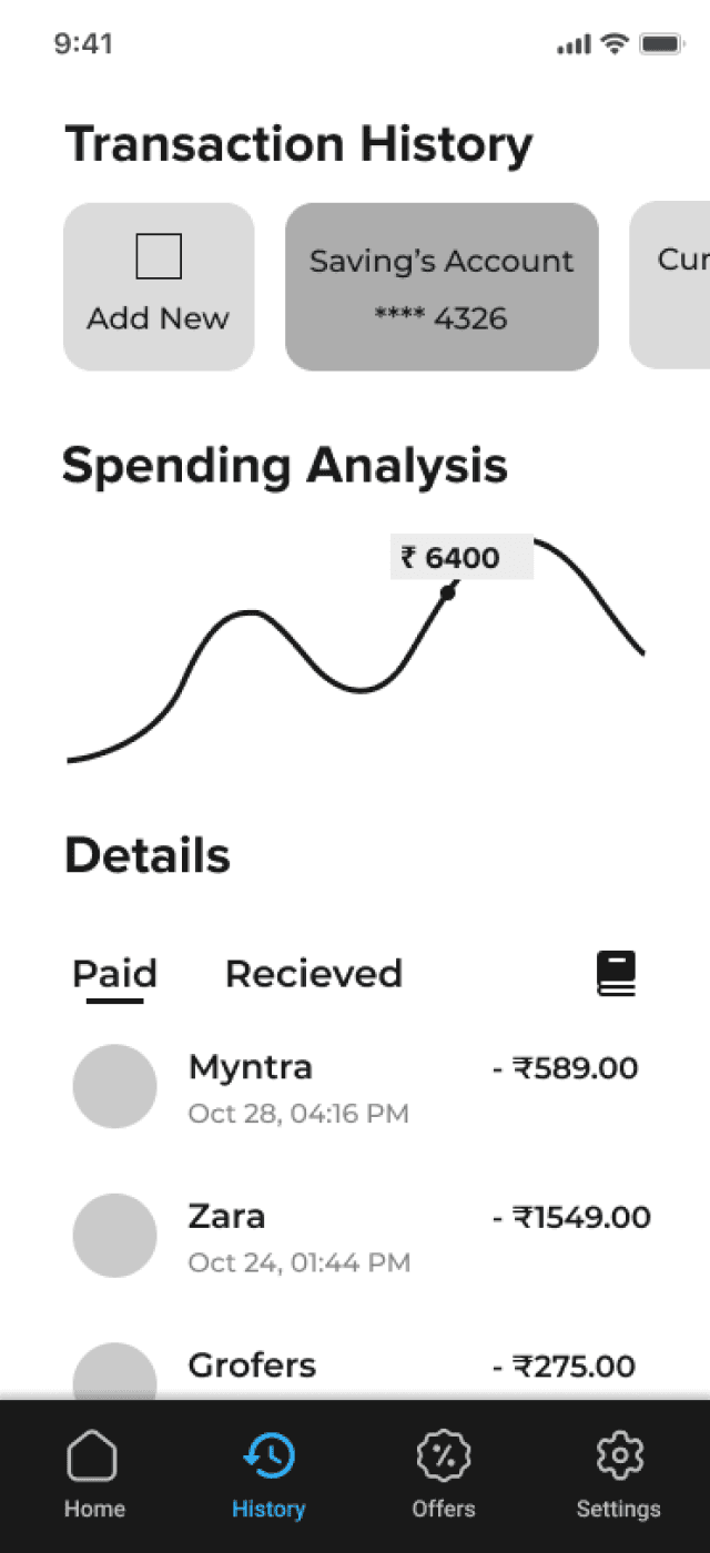
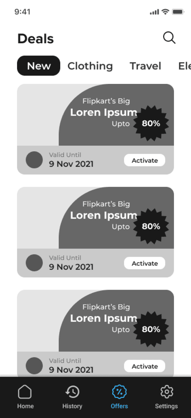
Following the initial sketching phase, I used Figma to create low-fidelity wireframes of 25 key screens. This process allowed me to focus on functionality and user flow without getting bogged down by visual details like colors and typography. Eventually, I shortlisted the most promising wireframe, which you'll see next. This iterative process has been instrumental in honing the core features of the redesigned YONO app.
Wireframing

UI Style Guide
I have created a color palette with 1 primary, 1 accent and 2 secondary colors. The choice of typography is Proxima Nova Montserrat. They are both geometric sans-serif typeface, simple and elegant.
With those elements added to my low fidelity wireframes, I made my way into high-fidelity wireframes.
#270073
primary
#D12052
accent
#050505
secondary
#626262
neutral
#E1E1E1
neutral
#F3F3F3
neutral
Color Palette
Montserrat
20px
Heading 3
Montserrat
28px
Heading 2
Proxima Nova
28px
Heading 1
Montserrat
16px
Heading 4
Typography
Aa
Proxima Nova
Aa
Montserrat
Final Design Outcomes

Hello! Let’s start our YONO journey.
Home
Home
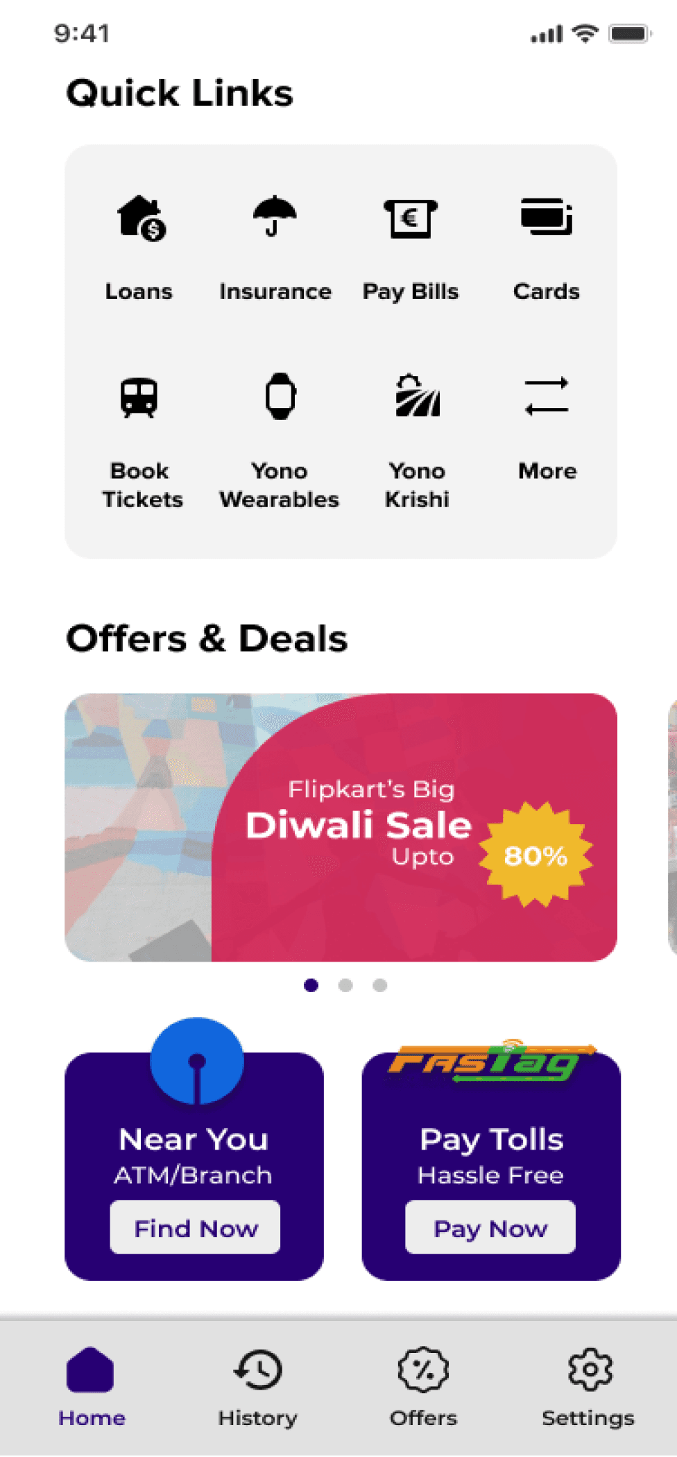
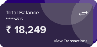
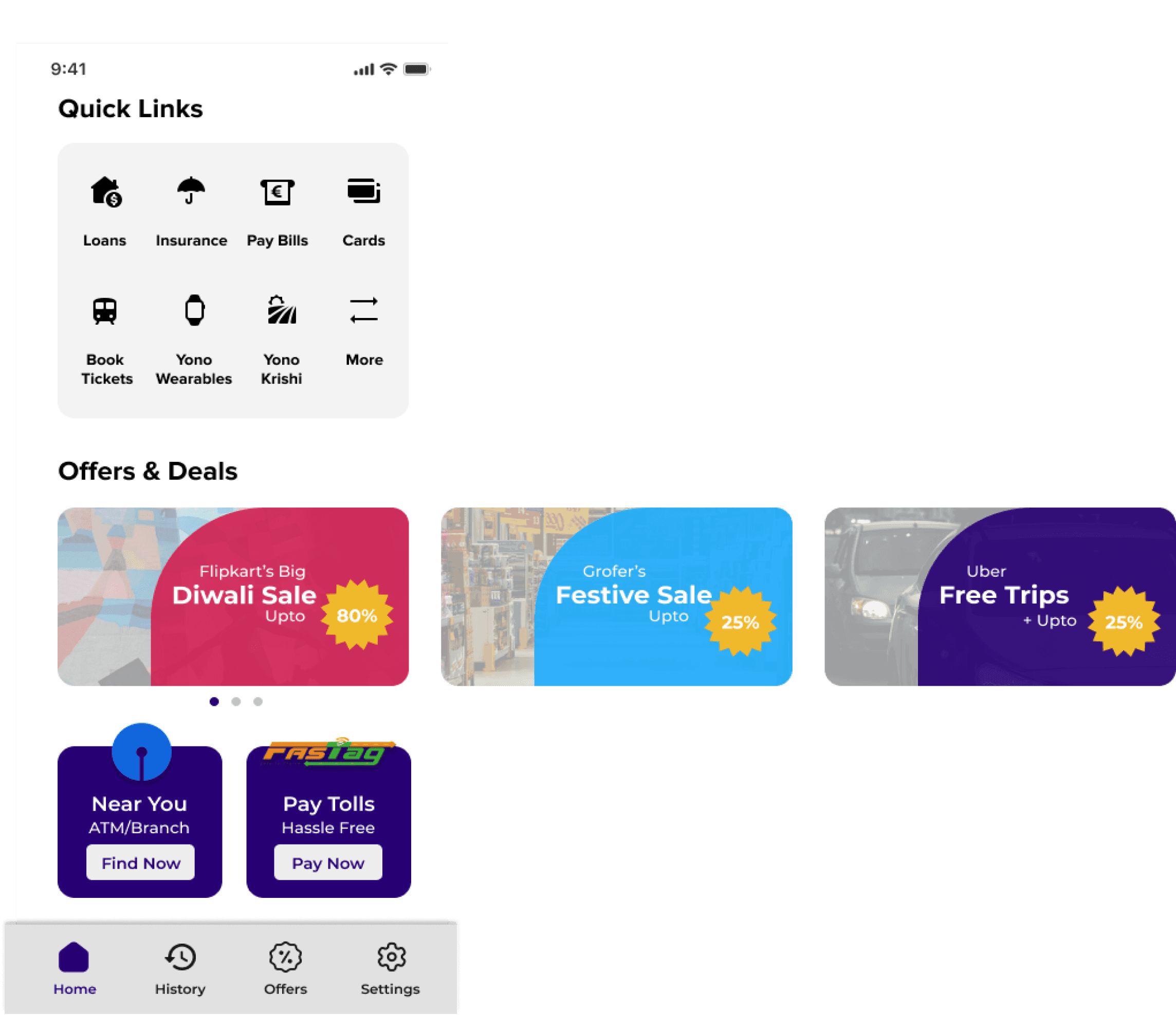
The app’s home page consists of Total Balance amount. Now you can easily toggle between multiple accounts. It further consists of important features of YONO like YONO Pay, YONO Cash, Investing and Shopping. Now you can easily transfer your money from homepage itself. Additionally, the offers section is clearly visible so you never miss out on the best deals.
Easily toggle between multiple accounts.
Pay with any method and approve/make requests in one tap.
Book tickets, pay bills, get loans and much more.
Shop carefree with YONO
Go cardless with YONO Cash feature.



Transactions History
History
History
Details
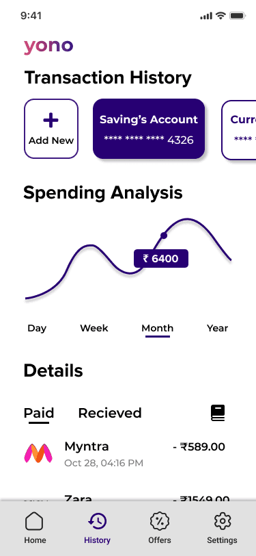

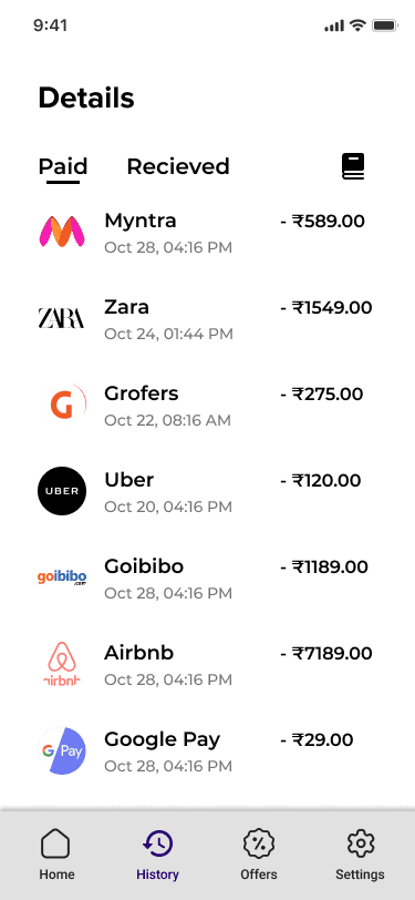


Check your spendings coherently with the help of the graph. Now, you can toggle and add as many bank accounts you have in SBI. Also, you can check detailed history of each and every transaction. Feature of m-passbook also helps the user download/view the pdf version of transactions.



Settings/Profile
Profile
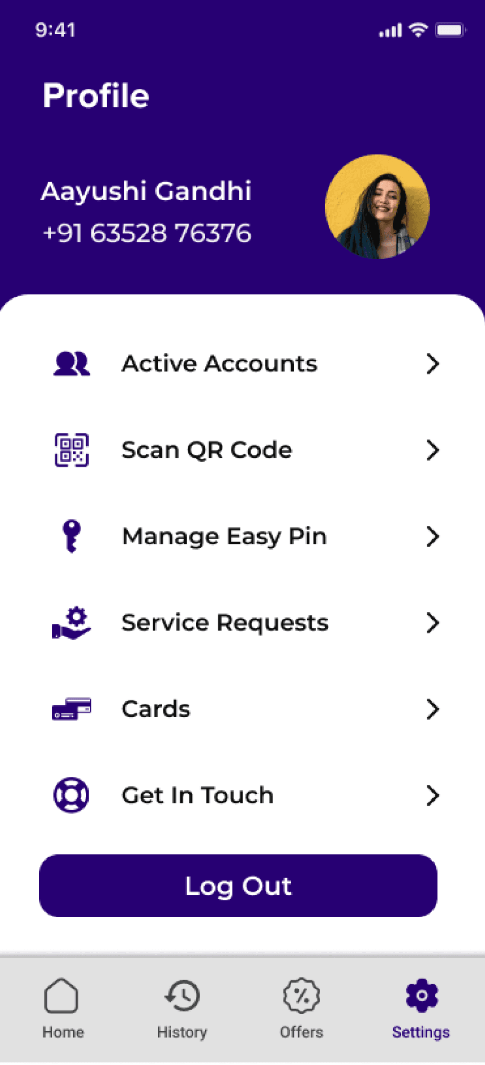
Know all the accounts you are connected through one Yono account. Change passwords and m-pin seamlessly. If at all you have any issues with the services provided, then you can apply for service requests or you can directly “get in touch” with SBI customer care.
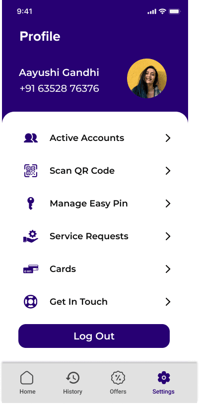

Apply and deactivate credit/debit cards online.
Scan QR code or recieve payments using QR code.
Offers
Offers and deals
Latest deals
Never miss the best deals. Plus, perks of being an SBI account holder provides the user with extra discounts and cashbacks.
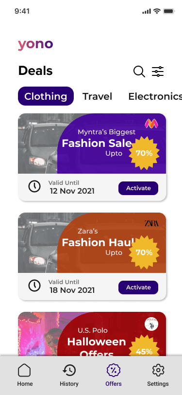

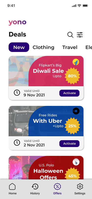

Check out your favorite sections.

Wealthier Health
Say “Hello” to A
16%
Activate
Valid Until
14 Nov 2021

Key Learnings
This project has been an eye-opening journey, and here are the key takeaways:
The Power of Low-Fidelity Prototyping: Sketching and creating low-fidelity wireframes were invaluable first steps. They allowed me to focus on core functionalities and user flow before getting lost in visual details.
User Experience is King: The importance of user experience (UX) was abundantly clear throughout the process. By prioritizing user needs and pain points, I was able to craft a design that caters to a better banking experience.
Research is Your Ally: The power of research cannot be overstated. From user surveys and interviews to competitor analysis, research provided a strong foundation for informed design decisions.
By following these principles, I believe this redesigned YONO app has the potential to be a significant improvement for users.
© Copyright

